I was approached by Embargo who wanted a whole new rebranding for their mobile app, as their current brand and design at the time wasn't as strong as they wanted it to be. The design and user experience needed to be improved in order to drive users and increase usability on the app.
I wanted to find out if there were any similar solutions already out there and, if so, what type of functionality they provided.
I reviewed as many similar companies as I could find, ranging from restaurant booking apps to loyalty and rewards apps.
I reviewed the Embargo product to understand all of the the user journeys, in order to see what could be improved and what was not relevant.
To do this I split my time between desk research - familiarising myself with the existing system and typical user tasks - and catching up with core internal users of the product who could help to guide me through any problematic task flows and share in-depth system knowledge.
I mapped out the key user flows initially with screenshots and annotations, and subsequently as high-level user flow diagrams.
I asked users about their methods for finding bars, restaurants and events when they're out exploring in our big city of London.
Using core values in the design of an app helps to drive it towards a specific goal. These are Embargo's:

It should be able to be used for any number of venues and rewards

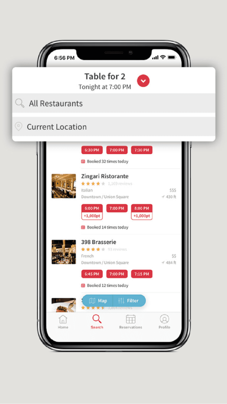
It has to focus on claiming offers and finding nearby venues

It has to be easy and fun to use, so it's not a hassle when you're out
As the old design looked outdated and didn't follow any key UI patterns, I made it key that the redesign follows modern UI and UX practices so users would have a more user-friendly and enjoyable experience. The app's colour scheme was the basis for starting to design this product, transforming from the old black and yellow to the new white and red, giving it a fresh feel to the brand.
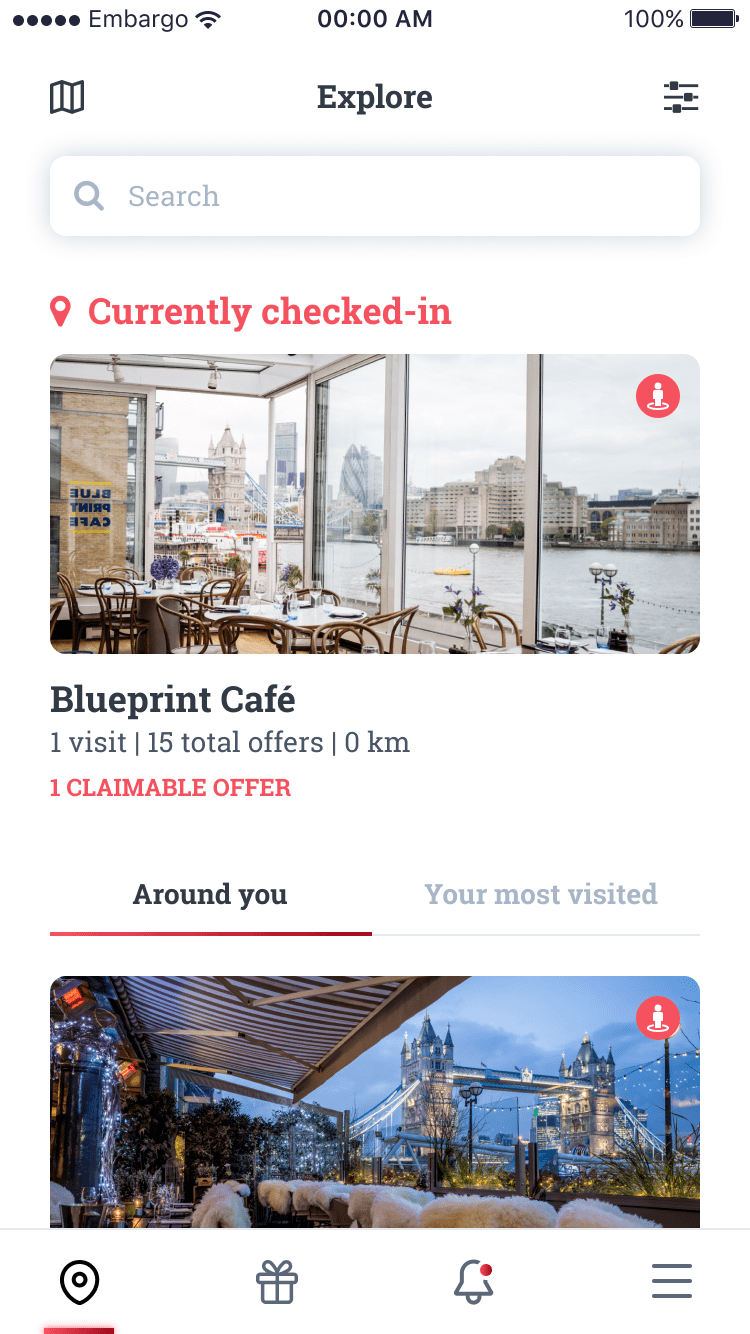
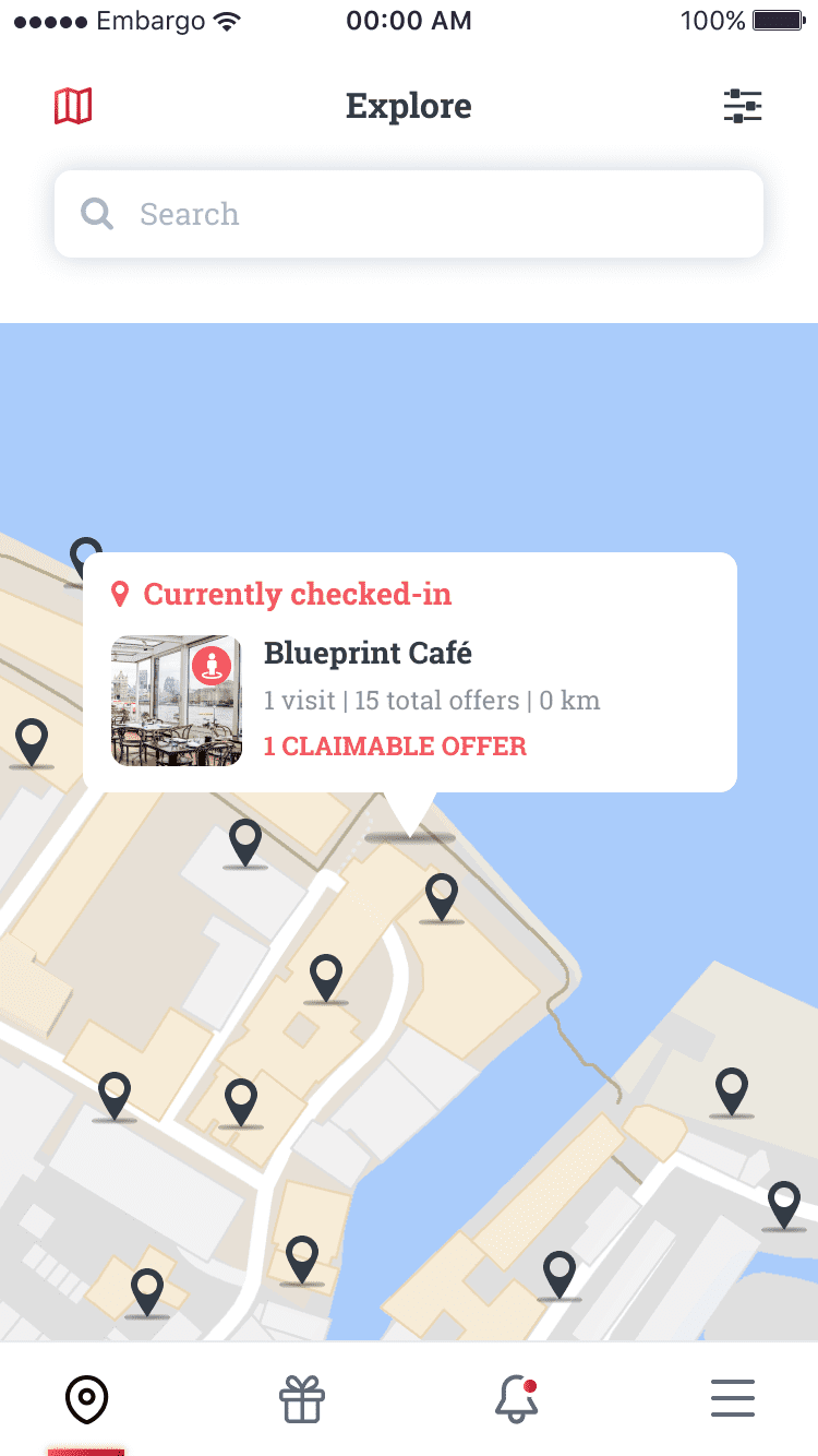
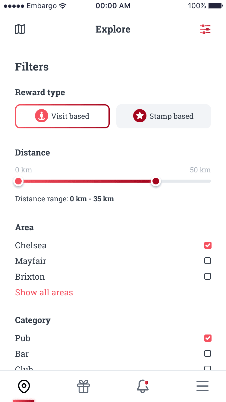
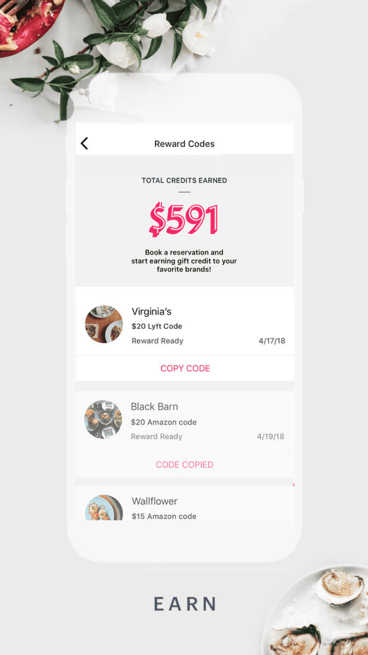
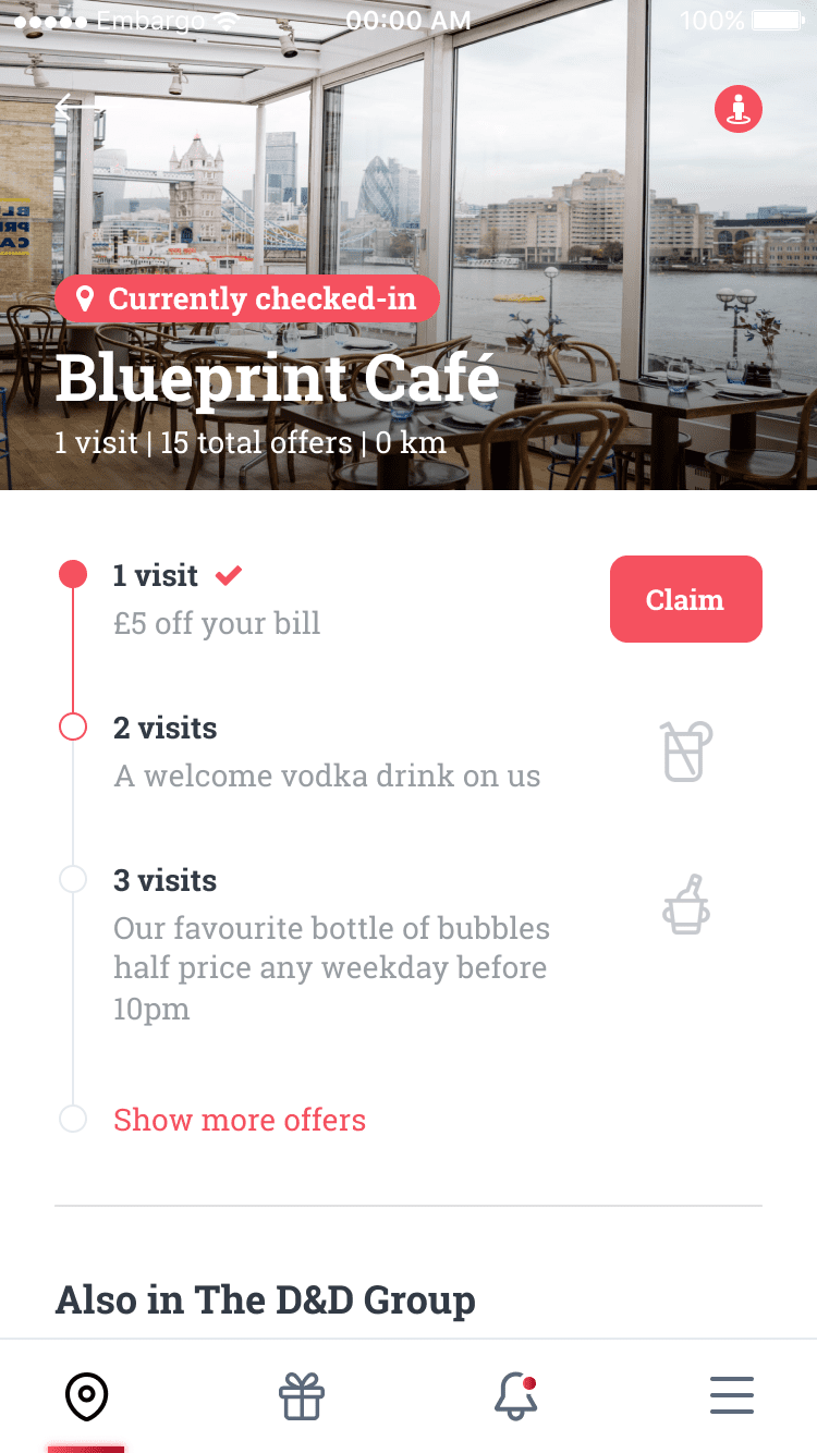
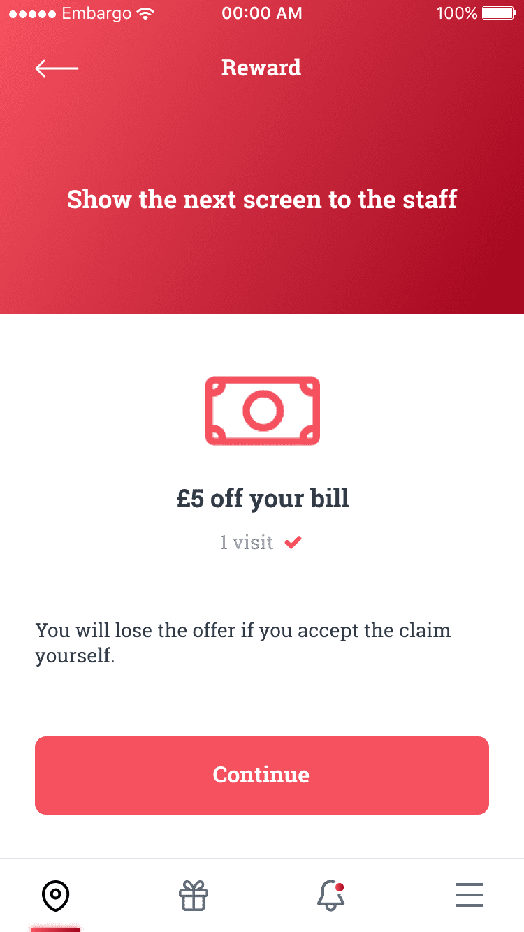
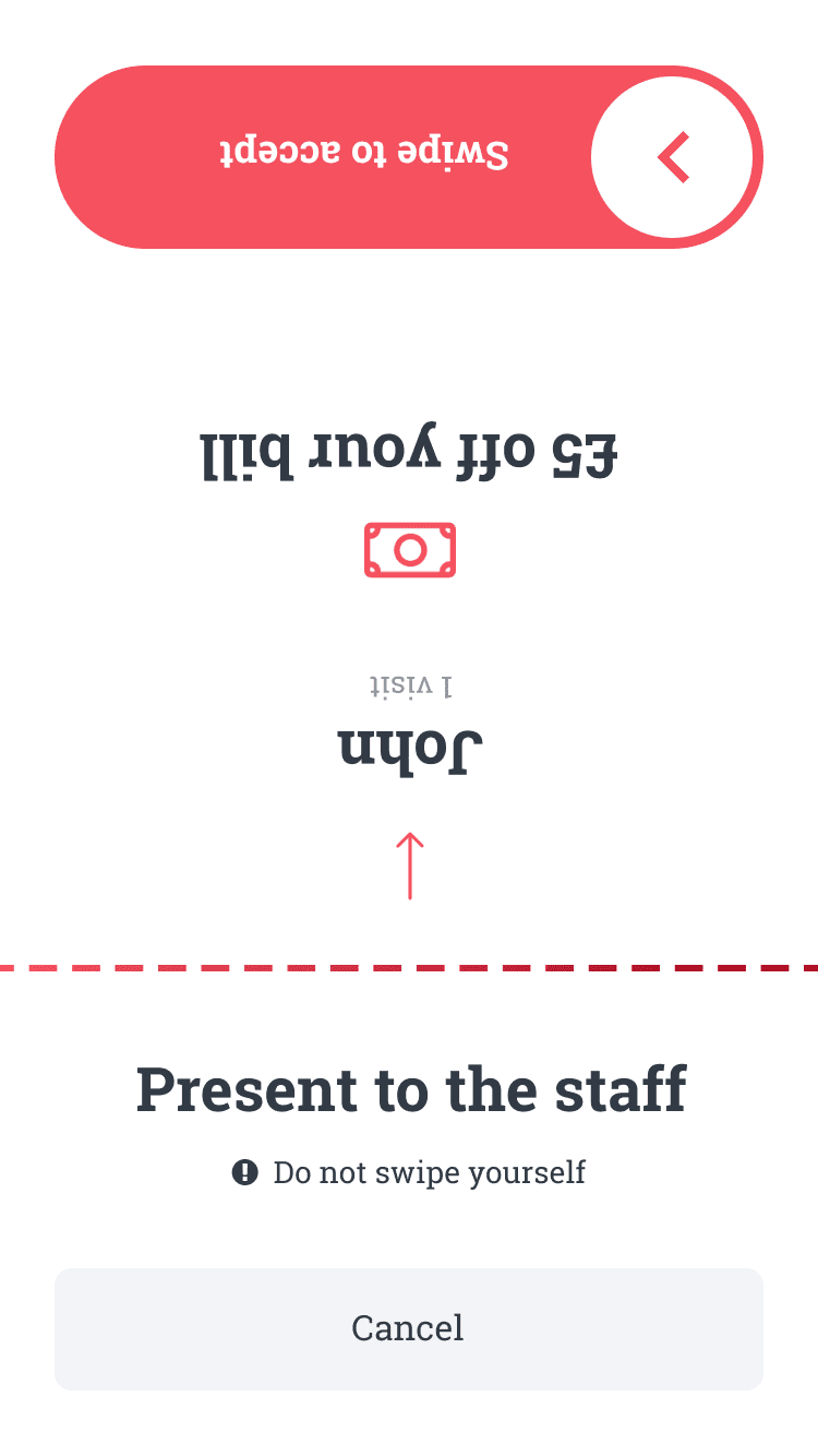
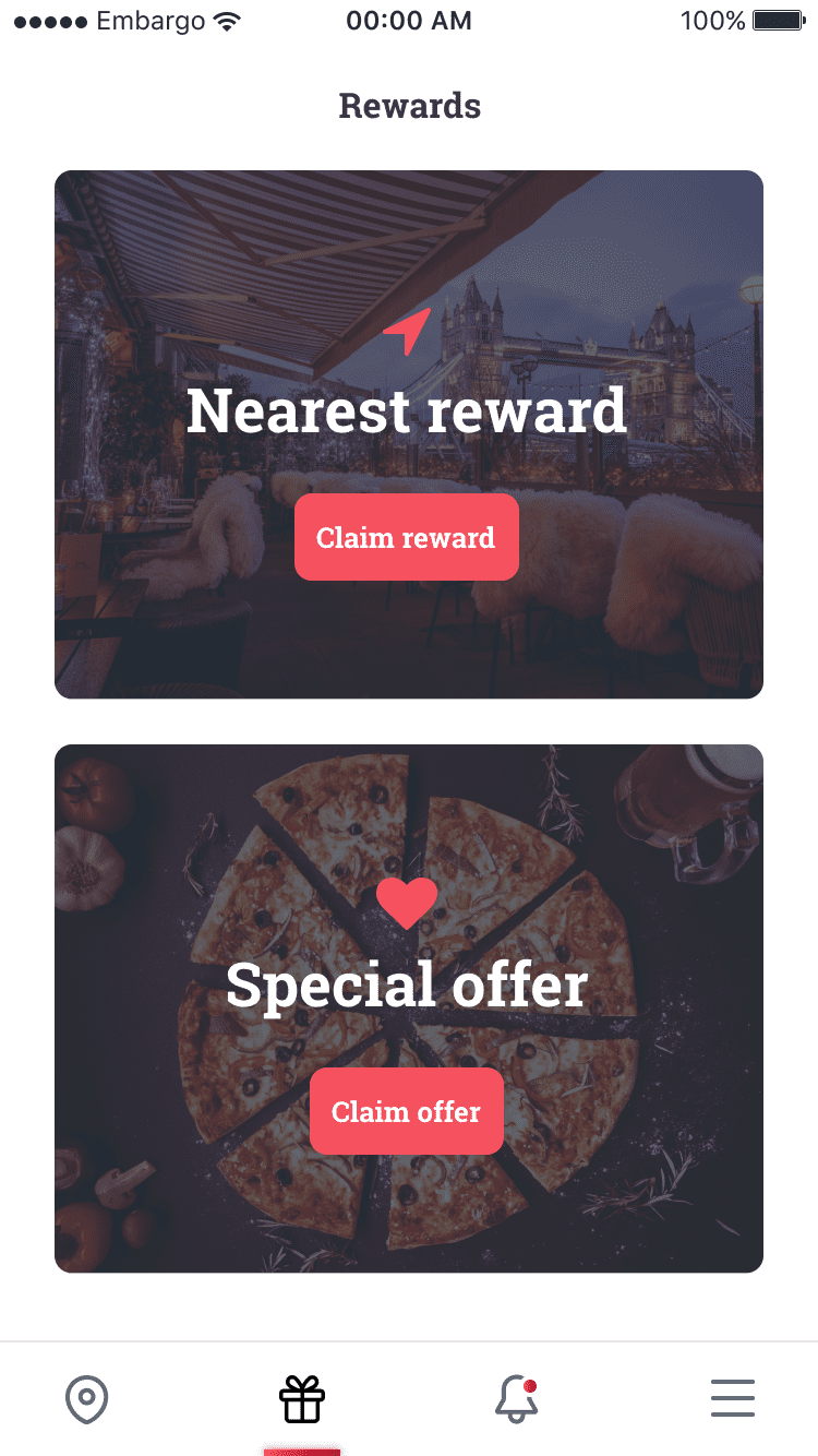
Rewards are the core of the app. There are two different types of rewards which are either visit-based or stamp-based. The app allows you to keep track of all your claimable rewards along with a timeline to see what other potential offers are available.
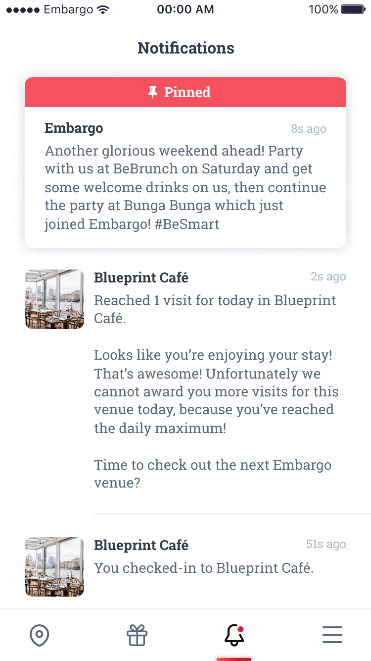
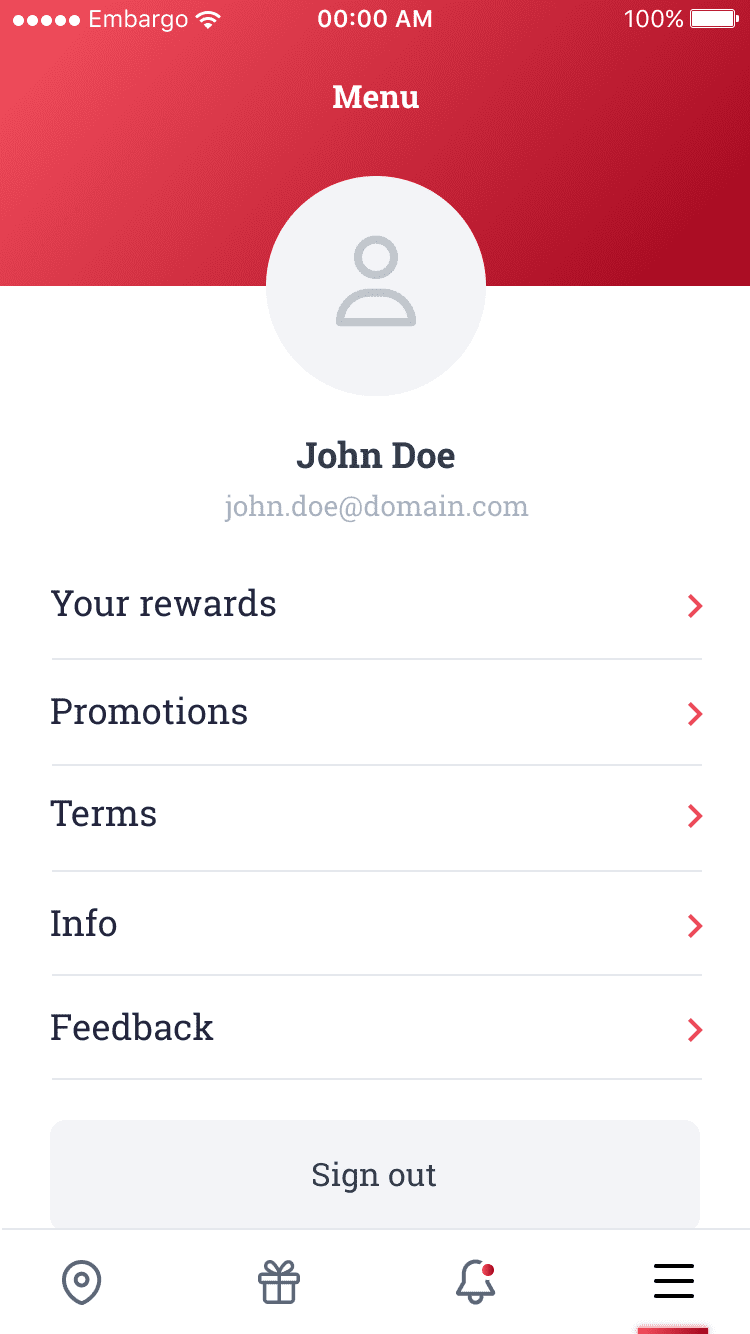
The redesigned menu has been stripped down to a clean and minimal interface so that it focuses on making it easy to navigate across the app. Each page and content within are carefully placed together so that the user is able to recognise a clear and familiar system at first glance.
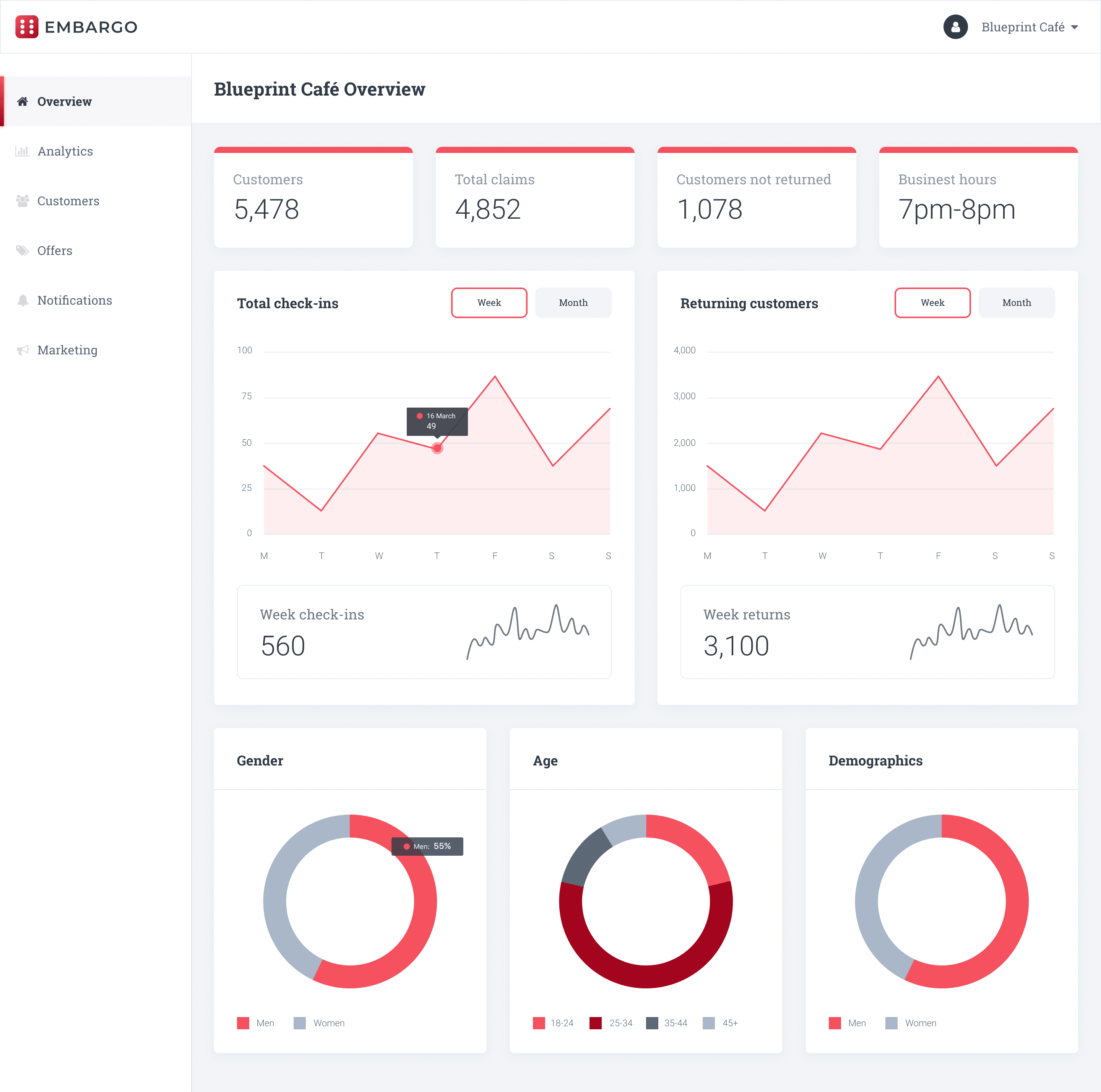
As the mobile app was solely for customer use, I had to design a web admin app for the businesses. This is where business owners are able to track and monitor their customers with dashboard analytics. It is also where they are able to create and manage their offers which are listed on the app, and create in-app notifications.
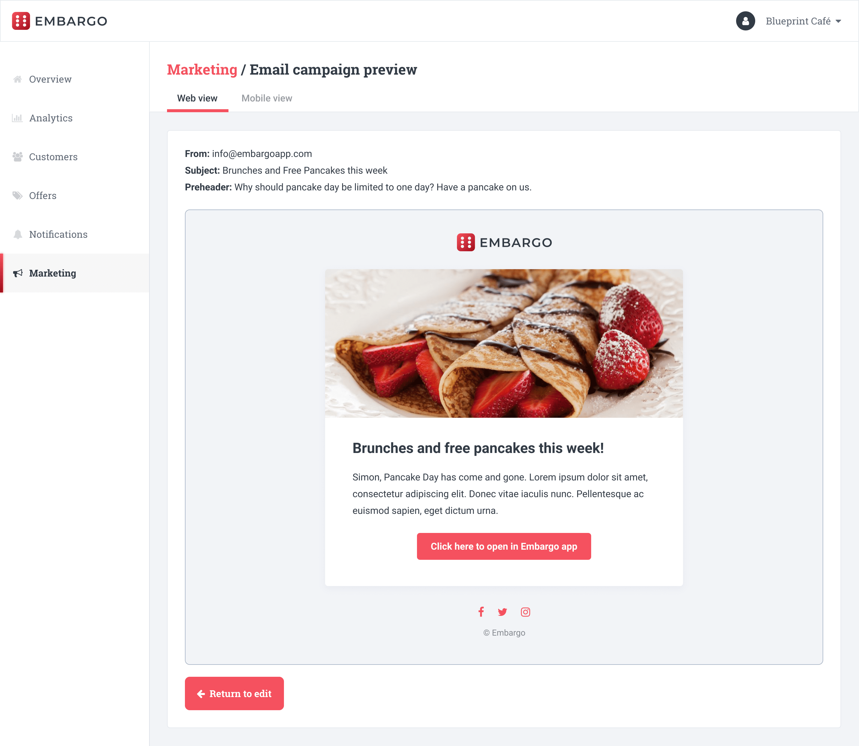
A key element in keeping the relationship between the business and customer close is the marketing campaign feature. This is where the business can create push notifications to the users phones or create email campaigns using a pre-made template.